installed


posted by Ben Volta at 2:31 PM
29 comments
![]()
![]()
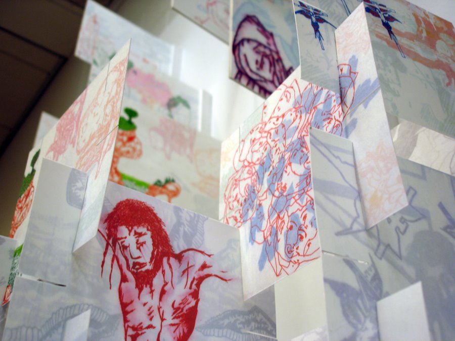
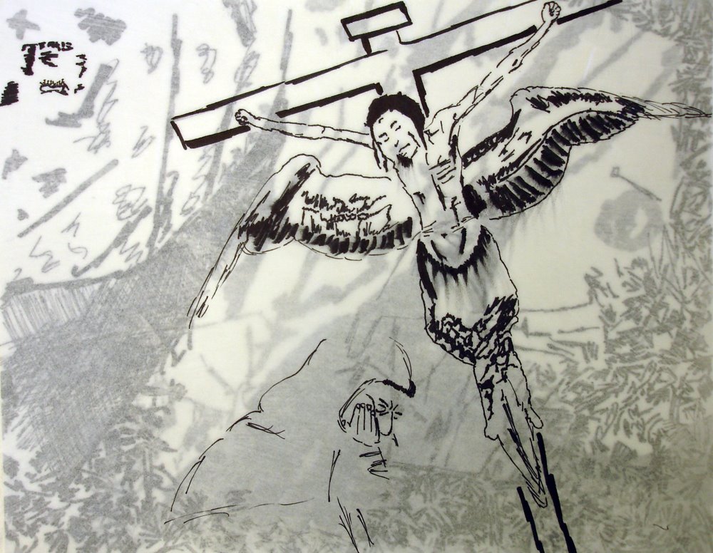
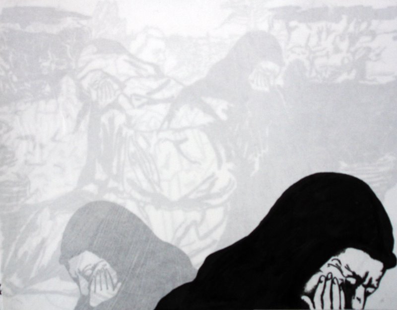
A Blog to document a project based on Jan Van Eyck's painting, "Saint Francis Receiving the Stigmata" with Joanne Garri and her students at Conwell-Egan Catholic High School. The project is part of the Philadelphia Museum of Art, Art Futures, artist in residency program.


posted by Ben Volta at 12:53 PM
8 comments
![]()
![]()


posted by Ben Volta at 12:34 PM
0 comments
![]()
![]()


posted by Ben Volta at 7:01 PM
1 comments
![]()
![]()
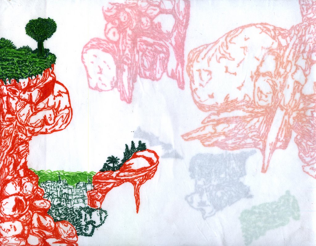
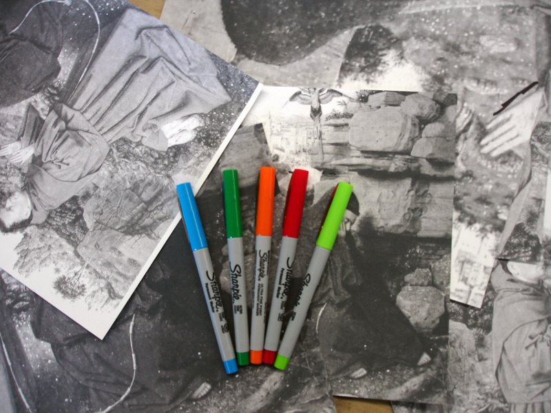 We voted on four colors. There was a tie between light green and dark green. The divide was intense, until we just decided to just go with five colors.


posted by Ben Volta at 6:52 PM
0 comments
![]()
![]()

posted by Ben Volta at 6:37 PM
7 comments
![]()
![]()


posted by Ben Volta at 1:28 PM
1 comments
![]()
![]()


